

Nyköpings kommun
Visual identity
Nyköping is a town in the eastern part of Sweden. It’s close to Stockholm, yet with enough distance to provide a different experience. It’s calm and a close to nature, with green fields, cosy woods and the sea just outside the city limits. For years, Nyköping has been known through its annual campaigns using arty, black and white photography, depicting a different kind of life. However, the visual identity has not aged well. It needed an update to make it work in a new world of communication, with new challenging formats and digital media.

As a municipality, Nyköping’s most important mission is to be approachable, including and user friendly for everyone. The extended identity needed to, not only engage and surprise, but also fit different communicative surfaces and purposes. It needed to be wide enough to handle a wide range of applications over the course of a year, but distinctive enough to always be Nyköping.


The original logotype is accompanied by a re-drawn and simplified version, an icon better suited for small applications and digital surfaces.

We have created a new Nyköping with more warmth and variety by adding components to accentuate the key parts of the brand – the blue color and black and white photography. The blue color palette is extended with warm modern colors that add both width and personality.
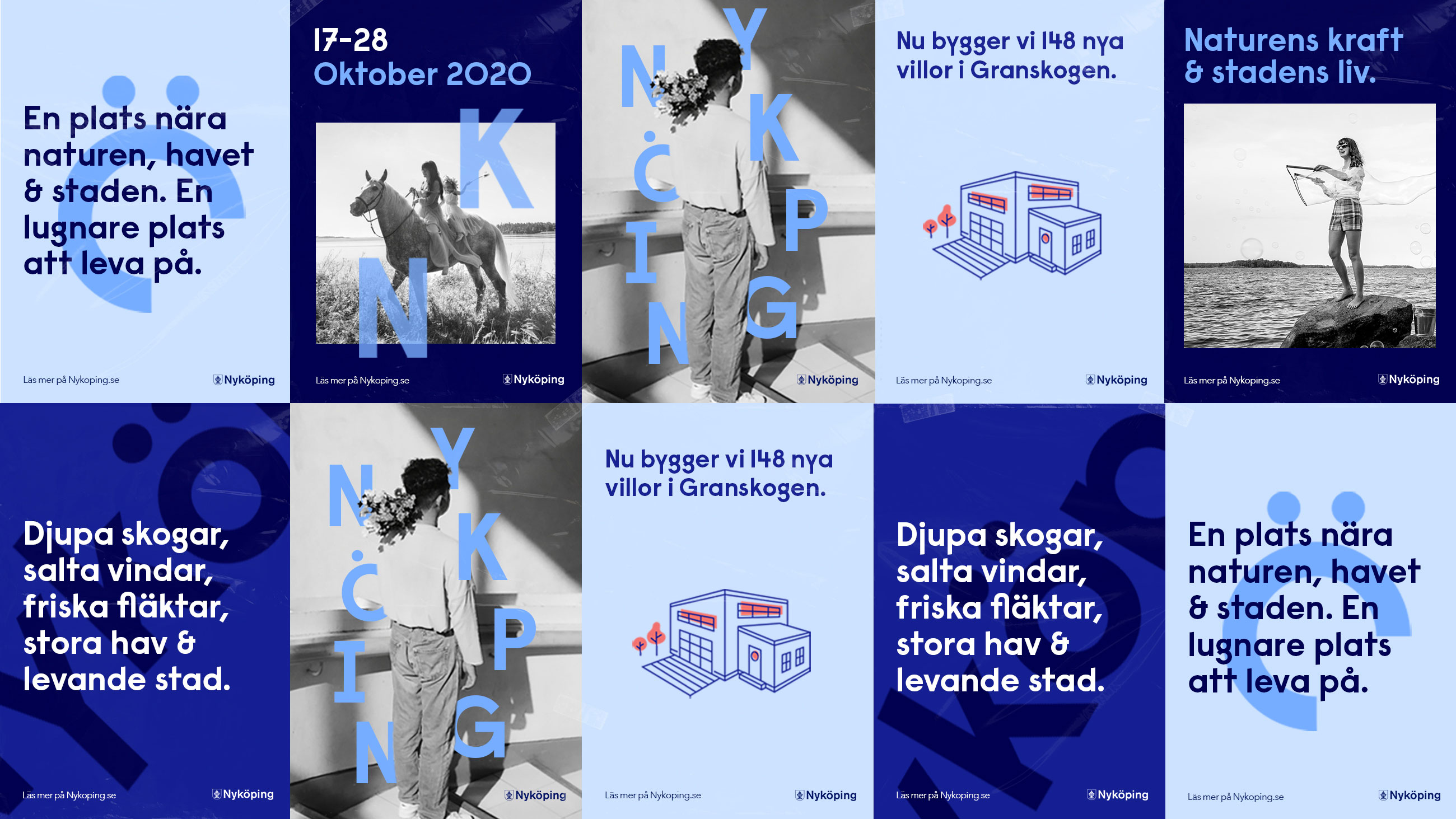


Illustrations add another dimension and create stronger brand recognition on the photography as well as backgrounds, seamlessly tying it together with a completely new infographic system. The new Nyköping is bold, warm and flexible – and it’s more like Nyköping than ever before.


More work
-
Granngården - Feel like you’re the best on earth
-
Sector Alarm - Keep some extra eyes on your home
-
Malmö stad - Cigarette Buttcoin
-
UL - We're on our way
-
Spendwise - In any case, you can trust your loan
-
Malmö stad - Språkresan
-
Sandvik - The Impossible Statue
-
Hövding - Protecting genius
-
Malmö stad - Cigarette Buttcoin
-
RFSU / Way Out West - The Livebrator
-
E.ON - The Jarnys
-
Kavall - Visual identity
-
BRA - Brand Identity & Concept
-
ByWe - The nordic hair care powerhouse
-
Lenovo - The new nudes
-
Ipren - Painful moments
-
Samsung - Make more of every moment
-
Malmö stad - Unwrap democracy
-
Sambla - Alla lån kan bli bättre
-
Malmö stad - Mobilitet
-
HOJ - Visualizing the love of movement
-
Malmö stad - Dirty talk
-
Samsung – Make life better
-
Skånetrafiken - Together we make the air better
-
Lif - Together we make the air better
-
Lenovo - Legiondary delivery
-
Nyköpings kommun - Visual identity
-
Skånetrafiken - Summer is now released
-
Unga Lukas - Orc therapy
-
Smarteyes - Eyewear for everyone
-
Volvo CE - Add silence
-
E.ON - Christmas campaign
-
E.ON - The electric revolution
-
Gillis Edman - Adding human warmth to life’s many stages
-
Smarteyes - Giving affordable design a new look
-
SL - A comfier way to travel
-
Lenovo - Silver Snipers
-
E.ON - Let's electrify Sweden, kilowatt by kilowatt.
-
Lindvalls - Riktig korv