
Lif
Humanizing medical research
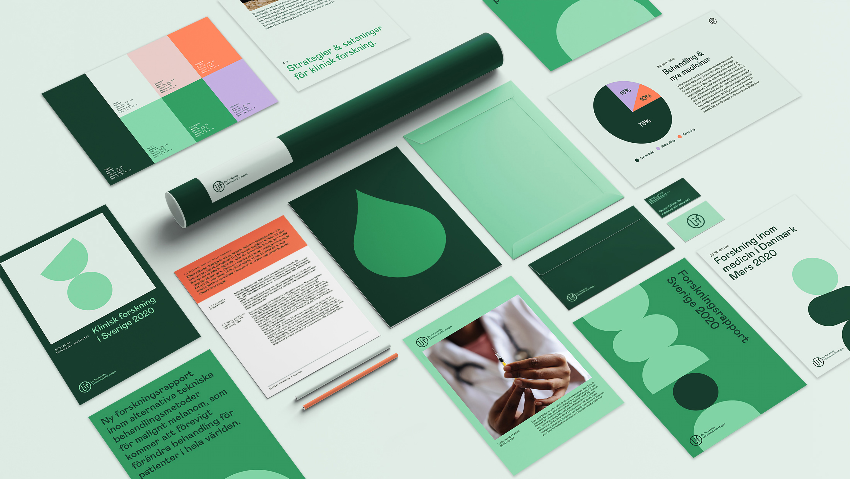
In 2020, Lif – De forskande läkemedelsföretagen (the Research based Pharmaceutical industry) is the industry organization for companies who conduct research within health and medicine. With growing interest in the sector and as a way to keep up with the times, they wanted a new identity to strengthen their brand and increase awareness of the work they do in the health and science sector.
The new identity needed to define Lif as a company, and communicate professionalism and seriousness in a modern, warm and personal way.

Approachable and professional
The new identity brings warmth to everything Lif touches – from live events to medical reports and web articles. Lif’s new, lively world is built on a monochrome green color palette, combined with complimentary eye catching hues of orange and purple. The strictness of the typography and tightly held layout creates a sense of professionalism that clashes nicely with the joyful color palette and abstract illustrations.


Icons
The geometric icon set made for Lif simplifies communication regarding the sometimes complex topics in the health and science sector.
Illustrations
The health and science sector is full of generic imagery. The illustrations developed for Lif’s brand identity helps them flair up science reports, presentations and brand material in a fun, yet minimalistic way. The illustrations where also animated for use in digital media.


More work
-
Granngården - Feel like you’re the best on earth
-
Sector Alarm - Keep some extra eyes on your home
-
Malmö stad - Cigarette Buttcoin
-
UL - We're on our way
-
Spendwise - In any case, you can trust your loan
-
Malmö stad - Språkresan
-
Sandvik - The Impossible Statue
-
Hövding - Protecting genius
-
Malmö stad - Cigarette Buttcoin
-
RFSU / Way Out West - The Livebrator
-
E.ON - The Jarnys
-
Kavall - Visual identity
-
BRA - Brand Identity & Concept
-
ByWe - The nordic hair care powerhouse
-
Lenovo - The new nudes
-
Ipren - Painful moments
-
Samsung - Make more of every moment
-
Malmö stad - Unwrap democracy
-
Sambla - Alla lån kan bli bättre
-
Malmö stad - Mobilitet
-
HOJ - Visualizing the love of movement
-
Malmö stad - Dirty talk
-
Samsung – Make life better
-
Skånetrafiken - Together we make the air better
-
Lif - Together we make the air better
-
Lenovo - Legiondary delivery
-
Nyköpings kommun - Visual identity
-
Skånetrafiken - Summer is now released
-
Unga Lukas - Orc therapy
-
Smarteyes - Eyewear for everyone
-
Volvo CE - Add silence
-
E.ON - Christmas campaign
-
E.ON - The electric revolution
-
Gillis Edman - Adding human warmth to life’s many stages
-
Smarteyes - Giving affordable design a new look
-
SL - A comfier way to travel
-
Lenovo - Silver Snipers
-
E.ON - Let's electrify Sweden, kilowatt by kilowatt.
-
Lindvalls - Riktig korv